A recommendation you can't explain won't get used
Jul 2026 10 min read
Why every career recommendation we produced shipped with a plain-language "why", how we extracted explanation signals from the model's own internals, and the honest ways those explanations can still mislead.
- ML
- recommenders
- explainability
The first time I showed a career-recommendation system to the people who would actually put it in front of employees, nobody asked how accurate it was. They asked: “How do we explain this to someone?” A model that tells a person their likely next role is making a suggestion about their life, and a suggestion with no reason behind it reads as either a black box or a mandate. Both get ignored. A recommendation nobody trusts is a recommendation nobody uses — and here, trust is the whole product.
So the explanation wasn’t a feature we added later. It was a requirement the model had to satisfy from the start: every recommendation ships with a “why”. This is how we got one that was honest, cheap to serve, and — the part I still find satisfying — mostly already sitting inside the model.
The problem
The recommender reads a person’s history as a sequence — the ordered list of roles they’ve held — plus a bag of attributes about them (department, location, and so on). From that it predicts the roles they’re most likely to move into next. That framing is good for accuracy, but on its own it hands you a ranked list of role codes and nothing else. “We think you’ll move into role X, confidence 0.7” is not something you can show a human being who is deciding whether to trust it.
We needed two things the raw prediction didn’t give us:
- Which parts of the person’s past drove this? Was it their most recent role, or something they did four steps ago?
- Which of their attributes pushed the score up or down? And can we say that in words a person recognises?
The approach
So we turned explanations on as a first-class output of every scoring run. Alongside the ranked predictions, each run emits, per person and per recommendation:
- a sequence signal — a score for each past role, saying how much that step influenced this recommendation;
- attribute contributions — a score for each attribute saying how much it pushed the recommendation score up or down.
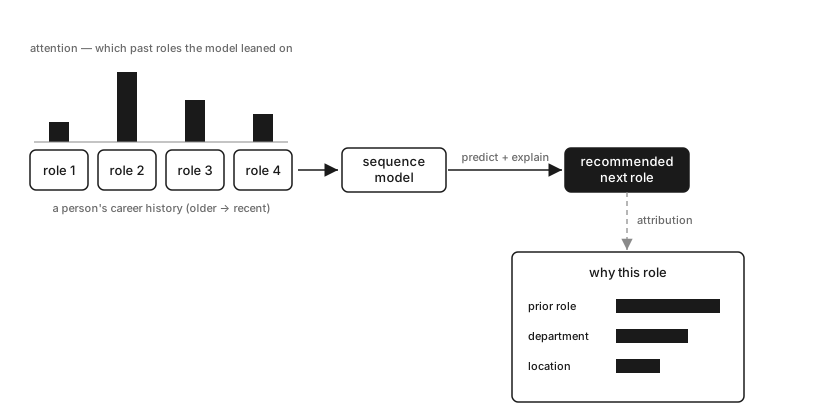
The diagram is the whole idea in one picture: a career history on the left, bars of different heights above each past role (the model leaned hardest on role 2), the sequence model in the middle, the recommended next role on the right, and below it the “why” — a few attribute contributions ranked by size.
The clever bits
A quick note on vocabulary first. ML models represent things — roles, people, attributes — as embeddings: lists of numbers (vectors). Picture each embedding as coordinates for that thing, except instead of two axes like a map there are hundreds. Things the model treats as similar sit close together; unrelated things land far apart. The model learns these coordinates during training, so “nearby” ends up meaning “genuinely related.”
Two small operations show up throughout, so it’s worth naming them up front:
- Dot product — line two equal-length vectors up, multiply them slot by slot, and add the results into a single number. Large and positive means the two point the same way (aligned); near zero means unrelated. It’s the standard way to ask “how similar are these two vectors?”
- Softmax — take a handful of raw numbers and rescale them into weights that are all positive and add up to 1. Handy whenever you want to read a set of scores as “share of the total.”
Sequence signal: how similar is each past role to the prediction?
The recommender is a transformer — a neural network built to read sequences. As it works through someone’s career history, it produces a hidden state for every position: a vector summarising that role in the context of the roles around it. The same job title yields a different hidden state for someone on a management track than for a lifelong specialist, because the neighbouring roles differ.
The model also produces an embedding for the role it predicts next. To find which past roles drove that prediction, we ask the same question at every position in the history: how aligned is the predicted role with this step’s hidden state? That’s one dot product — one number per step. Run those numbers through a softmax, and the largest weights point at the roles that mattered most.
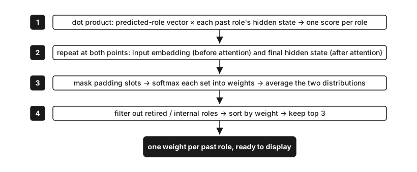
We score each role at two points and average the results. Before the attention layers, each role’s representation stands alone — it hasn’t mixed with its neighbours yet, so it cleanly captures that one role. After the attention layers, the representation is context-aware — the model has read the whole sequence — but attention blends positions together, so a single step’s vector partly reflects its neighbours rather than itself. Each point has the opposite weakness: the input is clean but blind to context; the final state has context but has diffused credit across positions. Averaging the two lets each compensate for the other. Step by step:
- For each past role, take the dot product of the predicted-role vector with that role’s hidden state.
- Do this at both points — the input embedding and the final hidden state.
- Before softmax, set padding slot scores to −∞ so they collapse to zero weight and can’t absorb any credit. Then apply softmax to each set of scores (positive, summing to 1) and average the two. (Empty padding slots — added to meet the model’s fixed input length — are masked before softmax so they don’t steal weight from real roles.)
- You’re left with one weight per past role. Filter out roles that should never be shown (retired positions, internal codes), sort, and keep the top three.
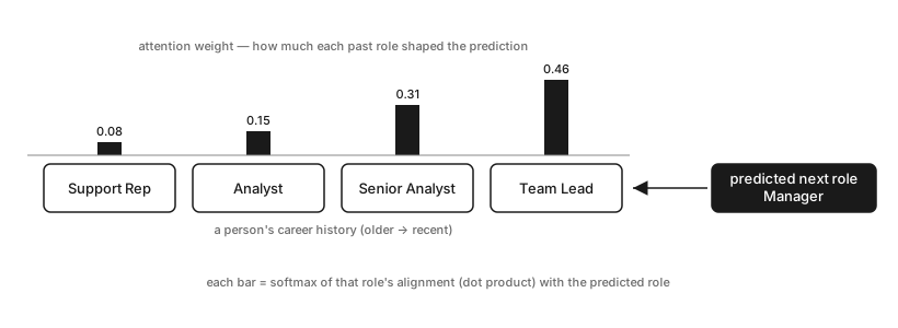
A quick worked example. Say the history is Support Rep → Analyst → Senior Analyst → Team Lead and the model predicts Manager. The weights might land like this:
| Past role | Alignment | Weight |
|---|---|---|
| Support Rep | 0.3 | 0.08 |
| Analyst | 0.9 | 0.15 |
| Senior Analyst | 1.6 | 0.31 |
| Team Lead | 2.0 | 0.46 |
The two most recent, most senior roles carry the most weight, so the displayed reasons are Team Lead and Senior Analyst.
One honest caveat: this weight is something we compute after the fact to explain the prediction. It isn’t an internal pointer the model was tracking — it’s a similarity we read off afterwards.
Attribute contributions: which properties drove the match?
A role and a person are each stored as one long embedding — but that long vector is really several smaller vectors glued end to end, one per attribute. The model tracks exactly which slots belong to which attribute: perhaps indices 0–63 are the job_family vector, 64–127 the management_level vector, and so on. Because those boundaries are known, we can split a single similarity score back into per-attribute pieces.
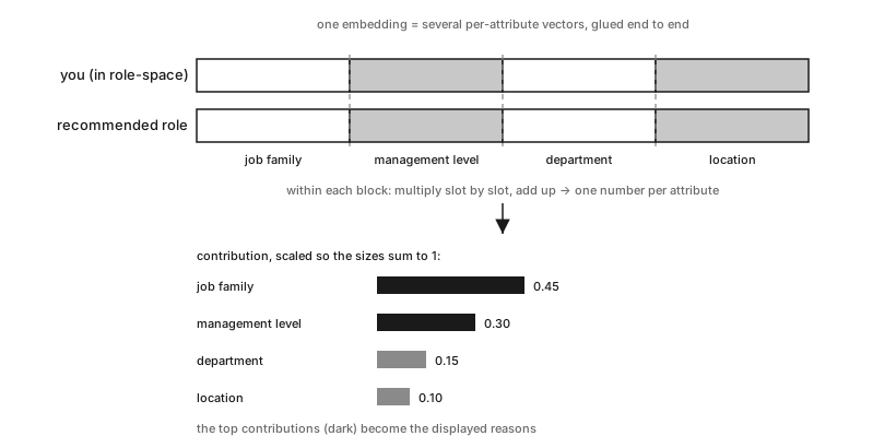
Comparing a person to a role has one wrinkle: users and roles live in different learned spaces, so we first pass the user embedding through a learned projection matrix that maps it into role-space. After that, the comparison happens block by block:
- Both embeddings are per-attribute vectors concatenated —
job_family,management_level,department,location, and so on — with known slot ranges. - Map the user embedding into role-space through the learned projection, so the two are comparable.
- Within each attribute’s slot range, take the dot product of the projected-user block and the role block — multiply each pair of corresponding values and sum the results. That single number is the contribution: how hard this attribute pulled the two embeddings together. For example, if
job_familyoccupies indices 0–2, andprojected_user[0:3] = [0.8, 0.3, 0.5]whilerole[0:3] = [0.9, 0.2, 0.4], the contribution is(0.8×0.9) + (0.3×0.2) + (0.5×0.4) = 0.98. - Scale the contributions so their sizes add up to 1, putting them on the same footing regardless of embedding length.
- Sort, and the top attribute names become the displayed reasons.
A worked example: the raw per-attribute pulls come out as job_family 0.9, management_level 0.6, department 0.3, location 0.2. Scaled to sum to 1, that’s 0.45, 0.30, 0.15, and 0.10 — so the surfaced reasons are job_family and management_level.
The tradeoff: a plausible reason can still be a wrong one
Similarity is not causation. A high sequence score tells you the model’s prediction embedding was numerically close to a history step’s hidden state — it does not tell you that step caused the outcome in any mechanistic sense. Likewise, a high attribute contribution tells you that sub-space aligned well, not that the attribute drove the decision. We were careful to phrase reasons as “the model leaned on…” rather than “you should do X because Y.”
The sharper risk is that a fluent, confident reason is more persuasive than a number, so a misleading explanation does more damage than no explanation. Two guards mattered:
- Not every attribute is safe to say out loud. Contribution scoring will happily tell you a recommendation leaned on someone’s pay grade or their manager — technically true, socially radioactive, and in some cases legally fraught. So the surfaceable attributes are an explicit allow-list, not “whatever scored highest.” The model is allowed to use an attribute internally without our being obliged to narrate it.
- Top-3, always. Showing three reasons instead of the full ranked vector isn’t just tidier; it stops us implying a precision we don’t have. The gap between the 3rd and 9th attribute is usually noise, and presenting it as a ranked list would invite people to over-read it.
The takeaway
If you’re building a recommender that nudges people — careers, health, money, anything with stakes — treat the explanation as part of the spec, not a dashboard you bolt on afterwards. The good news is that a transformer-based sequence model gives you a lot of the raw material for free: the hidden states it already computes can be reused as sequence scores, and the embedding structure naturally decomposes into per-attribute contributions. A sort, a slice, and some name cleanup turns those numbers into phrases a person recognises. The hard part isn’t producing explanations — it’s staying honest about what they are. Similarity shows alignment, not cause; a confident sentence can mislead more than silence; and the fact that the model used an attribute doesn’t mean you should say it did. Ship the “why”, but ship the caveats with it.